css3的clip-path
clip-path之所以没有很普及,是因为其浏览器兼容问题。很多IE浏览器对齐属性不是很支持。我们看下他的浏览器兼容:
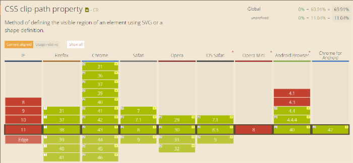
我们看到IE是完全不支持,尽量使用webkit内核,需要加上内核前缀-webkit-
例子:
看这个效果,对这个DIV进行了裁剪。
代码如下:
<div class="haorooms-small" style="background-image: url('http://sandbox.runjs.cn/uploads/rs/216/0y89gzo2/idtga8h3.png');">
  </div>

.haorooms-small {
    background-size: cover;
    width: 300px;
    height: 300px;
    -webkit-clip-path: polygon(0% 50%, 25% 0%, 75% 0%, 100% 50%, 75% 100%, 25% 100%);
    clip-path: polygon(0% 50%, 25% 0%, 75% 0%, 100% 50%, 75% 100%, 25% 100%);
}
clip-path的inset属性应用
<img class="clip-me" src="thing-to-be-clipped.png">
.clip-me {
  /* 最新规范写法 (没有定位要求), */
  clip-path: inset(10px 20px 30px 40px); /* or "none" */
  /* 值指的是 top, right, bottom, left 四个点 */
}
在clip-path的属性值中的inset()函数中有四个值,分别表达着top/left和bottom/right四个点,圈出一个矩形面积。这个矩形面积外的部分都将被裁剪隐藏掉。
clip-path的其他属性应用
.clip-me {

  /* 引用一个内联的 SVG <clipPath> 路径*/
  clip-path: url(#c1);

  /* 引用一个外部的 SVG  路径*/
  clip-path: url(path.svg#c1);

  /* 多边形 */
  clip-path: polygon(5% 5%, 100% 0%, 100% 75%, 75% 75%, 75% 100%, 50% 75%, 0% 75%);

  /* 圆形 */
  clip-path: circle(30px at 35px 35px);

  /* 椭圆 */
  clip-path: ellipse(65px 30px at 125px 40px);

  /* inset-rectangle() 将会替代 inset() ? */
  /* rectangle() 有可能出现于 SVG 2 */

  /* 圆角 */
  clip-path: inset(10% 10% 10% 10% round 20%, 20%);

}
SVG 裁剪路径样例:
<clipPath id="clipping">
  <circle cx="150" cy="150" r="50" />
  <rect x="150" y="150" width="100" height="100" />
</clipPath>